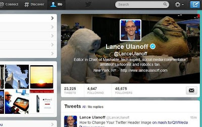
Twitter rolled out on Tuesday a series of design updates aimed to add more personality to member pages. Photos have been brought to the forefront and room has been made for Facebook Timeline-like cover images.
Twitter CEO Dick Costolo first unveiled the updates during morning news program The Today Show — an unlikely stage for a tech company that is continually introducing new features and designs. Since the announcement was coupled with a short segment about Twitter’s growth and success, it was likely part of an effort to introduce the platform to a greater audience not yet using the site.
The company also announced new apps for the iPhone, iPad and Android mobile devices.
Here’s a rundown of what you need to know about the news:
Behind the Header Photo
Member profile photos have been moved from the top left to a spot in the center of the page. Users can upload a long horizontal “header” image that resembles the cover photo concept currently used on Facebook and Google+. Existing profile pictures are embedded in the center of the header.
“The page itself has been reoriented to play up other visuals as well: Your avatar is no longer tucked in the corner, but will display front and center,” Twitter said in a statement. “The photo stream, too, has been moved up, and will now be accessible on the apps.”
How to Add a Header
First, visit your profile — the page that’s labeled “Me,” not your homepage — either on Twitter.com or via your mobile app. To add a header photo, visit Twitter.com/Settings/Design and select a photo from your existing library or port in a new one. To upload a header photo from a mobile app, visit to the “Me” tab, click the settings button (gear), tap “Edit profile” and then “Header.”
Note: After selecting a picture, you’ll need to scale it to size. The original image size can’t surpass 1252×626 pixels (with a max file size of five megabytes) and anything less than 640 pixels won’t look great.
App Upgrades
The iPhone app looks similar to what we’ve seen in the past, particularly in regards to the news feed and navigation. The “Me” section has been optimized for a header photo, however.
Meanwhile, the iPad app received a whole new user interface. In addition to highlighting a header photo and giving uploaded photos a bigger display area, you no longer have to swipe to reveal the sidebar. It also gives greater prominence to media — images now appear full-screen and links show up within the tweets when expanded. The company called the iPad app more than just an upgrade.
“We’ve rebuilt the app from the ground up to make it fast, beautiful and easy to use,” Twitter said in a statement.
Twitter also noted that the news represents “our mobile-first strategy.”
User Reaction
Mashable conducted a poll after the news was announced to gauge user feedback, and 47% said they loved the emphasis on photos and the new header. About 27% said cover pictures are “so 2011,” while 25% said they were indifferent.

No comments:
Post a Comment